Do I Need an Author Website?
Nowadays, every author needs a website. Agents and publishers expect an author website before you ever contact them. And your website may well be a top way readers find you and your book.
And, so, many of my clients find themselves asking me, “What do I need? Can you look at my author website and tell me what’s missing?”
I’ve answered these questions so frequently lately, I figured it’s time for a post on the subject:
What to Put on an Author Website: 12 “Must Haves”
1. Your Name: Okay, obvious that your name should be on your page. Make it prominent. Generally, it’s best for your URL (the website address) to be your name. That way the website name will always be relevant, even if you start writing different types of books. If your name is just too common, you may need to get creative—add a middle initial, middle name, “MD,” or other qualifier. Actually, if you’re an MD, put that in the URL no matter what!
2. Contact information: If you want lots of calls, make your phone number big and place it in the upper right corner above the banner. On the other hand, if you prefer to screen your phone interactions, use a “contact” button or tab on the navigation bar instead, and have the primary mode of contact be by e-mail. Should you provide your email address on the “contact” page? Only if you like getting spam emails. Use a contact form to avoid spammers.

3. An Inviting Photo of You: If you’re a nonfiction author, potential readers want to connect with you and get a sense of who you are, whether they trust you, and, if you are providing other services in addition to your books, whether they want to hire you. Your author photo says a good deal about the kind of person you are. Find a photographer who makes you feel comfortable. Just by relaxing, you take years off your projected age! Plus, relaxing makes you look approachable. Your photo can be in the banner (an image at or near the top of the page that goes the width of the screen) or it can appear below the banner.
What to Put on the Navigation Bar of Your Website
The Next 5 elements should all be part of the Navigation Bar—that collection of tabs or buttons that visitors can click on to get to another page—or to get a drop down menu with sub-categories:
4. About Tab: This gives visitors a sense of what you do and why they should explore some more. It can include separate drop down tabs for things such as your personal bio or company mission.
5. Services: If you offer services such as consulting, coaching, healing, teaching, this tab or drop down menu can provide the details. You can name the tab more specifically based upon the services you are offering, such as “Coaching,” “Editing” or “Book Writing Classes.”
6. Media or Press: This page should accomplish four things: i) Journalists or show producers should get a sense of your expertise, TV presence and/or how articulate you are, in order to help them decide to interview you or feature you in their article or on their show. ii) Potential clients should get the sense that you are an expert in the area they are seeking help. iii) Conference organizers and other people who hire speakers should also be impressed by your media credentials. iv) If you wish to traditionally publish, this page should demonstrate to publishers that you have a “platform” (following, community and the foundation to reach readers) and that you will be an attractive candidate for media interviews (i.e. you are well spoken, entertaining and knowledgeable in interviews).
Include links to online media and videos. It’s also a good idea to include a press release visitors can download. Do make sure the press release is media-savvy and not just about your book. The book should be a credential, not the focus.
At the suggestion of my Virtual Assistant, Geri Lafferty, I added this media banner to my media page (it’s bigger in real life):
![]()
Logos can add instant pizazz. You can find designers at Fiverr to create inexpensive banners that look professional.
7. Speaking: If you do any public speaking, a speaking tab will help conference organizers and others find the information easily. Include a bio, head shot, list of speaking subjects or titles, list of venues where you’ve spoken, and overall description of your style, skills and subjects. This is a great place to include testimonials. And a speaker reel (video of you speaking at various engagements) is often a must–conference organizers want to see you in action!
8. Blog or Podcast: If you don’t blog or host a podcast, consider it. Search engines like Google LOVE websites with relevant content and every time you blog you are adding relevant content to your website. Blogs also offer a way for prospective readers and clients to get to know you, a way for people to find you through social media and a way for you to get to know your readers. Through your blog, you create community and long term relationships. You will find out what subjects most engage your readers, which can help you in writing your book. You may even get some great stories from readers of your blog—stories you can include in your book with their permission.
More Must Haves to Put on an Author Website
 9. Social Media Share buttons: Give people the opportunity to follow you on Twitter, YouTube, Tik Tok, LInked In and Instagram, join your Facebook group and find you on any social media that’s most relevant to your particular audience/market. Social media is rarely optional for authors anymore.
In fact, a publisher recently offered a client of mine a book deal under the one condition that she focus on developing an engaged social media following well before her publishing date. She did so, especially on Twitter, and it helped her book sales substantially.
Your Lead Magnet or Opt-in Gift
10. A Juicy Opt-in: “Opt-in” refers to the idea that you want visitors to opt-in to receiving e-mails from you. You may also hear it called “lead magnet” because it helps you attract sales leads, “free offer” or “freebie.”
In the “old days” when the internet was young, a newsletter provided enough incentive for visitors to share their e-mail with you, but now it’s usually not compelling enough in these days of crowded inboxes.

What can you provide visitors that will truly be of benefit and help visitors to your website solve an immediate problem or challenge they face? Your vehicle can be a tip list, quiz, special report, audio, mini-course or e-book.
More importantly, the benefits of the opt-in gift should be indicated in the name or a few short bullet points in the sign up box.
Nowadays, many people offer more than one opt-in gift or lead magnet. You may offer one or more on your home page and others on pages specific to certain audiences or their needs.
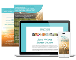
For example. on my home page, I offer the Inspired Author Support Kit, which includes two worksheets that help people get started on their books and get over self-doubt or overwhelm. The core of the support kit is a 7+ day e=course to get them started and asking the right questions, so they write the “right book.” And the Inspired Author Support Kit includes a subscription to my newsletter which is full of valuable articles and tips as well as information on webinars and other seminars that can help my subscribers write the best book possible and make it successful.

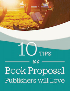
But people come to me for a variety of reasons and with different needs. So, I offer other opt-in gifts on particular pages. For instance, on my How to Write a Book Proposal page, I offer 10 Tips to a Book Proposal Publishers Will Love. The gift is offered in the right hand column and on a pop-up that appears on the page after a minute of browsing. On my Find an Editor page, visitors are invited to sign up for 7 Questions to Ask an Editor Before You Hire Yours. Ask yourself whether you have visitors with different needs and whether you can tailor your gifts to the specific pages. You can repeat relevant opt-in gifts on related blog posts, as well.
While an opt-in gift in the upper right corner of the page, below the navigation bar, is still effective, some website owners use a bar below their banner or navigation bar or even just a large portion of the screen below the banner or navigation bar. And many of us use pop-ups. If you use a pop-up, give users some time before the pop-up shows up, at least 10 seconds. Also, try to make the pop-up easy to close. You don’t want to annoy your visitors.
Most visitors who do not sign up for an opt-in gift will never return again, even if they bookmark your page and love it. On the other hand, your opt-in allows you to gather their e-mail address and grants you permission to continue to contact them with relevant information. Now you can develop a relationship with this prospective customer over time. I tend to ask for first name and primary e-mail address. The more information you ask for, the less likely they are to sign up, so keep it simple.

11. Testimonials: I don’t know about you, but I don’t like having to “sell” anything. I love that people visit my home page, read the testimonials and often contact me already knowing I’m the book coach for them, because the testimonials gave them all they needed to know about the results my clients have gotten and the things they love about working with me.
Don’t be shy in asking for testimonials. And ask for headshots or high quality photos of each person. A picture of a happy client says it all!

12. Your Book: Be sure to prominently display an image of your book (or books) and links to buy! This helps brand you, provides credibility and sells more books, too!
There’s so much more one can say about designing an author website and what to put on an author website. The upshot, though is to answer these questions before you start:
5 Questions to Answer Before Designing Your Author Website
1. Who are the different groups of people who will be visiting (potential book buyers/readers, potential clients, current clients, journalists, conference organizers, etc.)?
2. What is each of those constituents looking for?
3. What action would you like each of these groups to take?
4. What would make their experience ideal?
5. What is consistent with your brand (include colors, wording, images, etc.)?
Examples of Author Websites
Here are some examples of beautiful author websites designed using Pixpa, an all-in-one-website builder used by photographers and creators. While not all the examples have all the elements I suggest you include, the designs are eye-catching and Pixpa is an empowering platform; just be sure to add my advice on content to what you find in their article.
A Few More Tips to Get More Visitors
Optimize your website so that your web pages show up in searches! A few things that will help your site be found:
- Excellent relevant content such as blog posts and articles.
- Using the right keywords in your titles and posts – Yoast SEO is a great tool for that.
- Having inbound and outbound links (links from other reputable websites to your site, links from your site to sites to relevant, high quality websites and links to a couple of additional posts or pages within your own site).
- An easy to navigate site.
- Quality design.
- A site that works well on computers, tablets, phones and with different browsers. Do some testing to make sure!
- Photographs tagged with keywords.
Let’s Hear from You!
Anything I left out that you think is crucial? Any questions on this important subject of what to put on an author website? I’d love to hear from you—please share your comments or questions below.


Great article Lisa! I wonder how video contributes to this discussion… Any thoughts or experience here?
Greg, that’s a great question. Video is an excellent way to connect with your readers. Certainly it’s ideal to have video on your speaker page and media page so that potential TV producers or conference organizers can see you in action. It can also be effective to have video on the home page, but make sure it’s well executed. I’m going to ask my assistant Geri Lafferty to share the name of the video person she recommended–he gave feedback on our home page video and I will put his advice into practice on the next video.
The awesome Cory Fossum at Fossum Creative is the one! http://www.fossumcreative.com/ He can produce a video that tells y our story like no other.
Thanks, Geri.
Thank you
Great piece, Lisa!
This is a great primer for authors trying to decide how to create the best possible website.
A few additional notes:
1. Make sure to have the contact information for your publicist (or yourself) also on the press room page so that journalists who land there can easily figure out how to get in touch with you.
2. As you mention, a blog is so important for both SEO and platform growth, and it’s extremely important that authors understand that the blog needs to ‘live’ on the website as opposed to a link to another site (like Blogspot). You splinter your SEO value if your blog is offsite, as opposed to a page on the actual website.
3. Your opt-in should be visible not only on your home page, but on the sidebar of each subpage on your website (including your blog). No matter what page someone lands on we want them to have the opportunity to join your list.
Keep up the good work, Lisa!
Rusty
Thanks for adding to the discussion, Rusty. The websites at Shelton Interactive are great examples of author websites that deliver for all the different types of visitors who come to the site (readers, prospective clients, media, conference organizers, etc.). These are important points you make–the point about having an embedded blog is crucial for SEO and great points about the opt-in and publicist contact.
Lisa, This is a wonderful blog filled with incredibly helpful suggestions. I have already shared it with others. You are awesome! Thank you! Patrick
Thanks, Patrick. Your question was the inspiration.
Pure perfection!!! This is a best seller eBook if you ask me!!! Fabulous content of golden value!!! 🙂
Hi Lisa.
I am completing a proposal for my non-fiction book. I know it is important to have a website related to my writing, but as I have not yet published my book, I am not sure if or how to reference the book on my website. Any insight would be appreciated.
Thank you.
Hi Leilani,
I’m glad you asked. Do not include the book before you have a publisher. Just know you’ll add that later. Listing the book confuses publisher and makes them wonder whether you’ve self published it already. And having too much information about a book that’s not published is not good either. I’ve heard many publishers and agents say not to offer a free chapter, for example.
Good luck with your proposal! Let me know how it goes and if I can be of further help.
Lisa
Hi Lisa,
Love your emails!
Just wondering if I should create a landing page for my unpublished book to start getting emails with a lead magnet even though I’m putting together a proposal for traditional publishing.
Thanks,
Natasha
Yes, publishers will want to know you have a significant mailing list and traffic to your website– that the moment your book is published you have a community that is ready to buy it.